
The choice of colors is a central element in interior decoration. In 2025, color trends are evolving to reflect our growing need for harmony and well-being within our living spaces. This article aims to explore the trending colors to refresh your interior, highlighting the vibrant and calming palettes that will transform your rooms. We will also examine the psychological effects of colors on our state of mind and how to choose the shades that suit you best. In addition, you will discover how textures, accessories, and even common mistakes can influence the aesthetic effect of a color. Whether you are a design enthusiast or a decorating fan, this article will guide you through your choices to create a welcoming and harmonious environment.
Need help choosing colors to refresh your interior? Quickly find a qualified professional on Helplease and benefit from a tailor-made service for all your needs. Discover professionals near you!In 2025, the colors emerging as trends are often inspired by nature and our need to reconnect with organic elements. Shades like sage green, sky blue, and soft terracotta hues are taking center stage. These shades not only bring a sense of calm, but they also promote a connection with the natural environment.
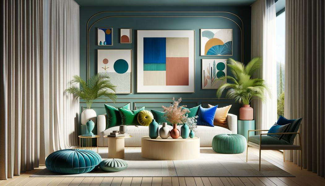
The blend of bright hues such as mustard yellow or coral with softer tones creates an interesting and warm visual dynamic. Using colors like these can revitalize your interior, making spaces more welcoming and contemporary.
Additionally, pastel colors remain highly popular. They are ideal for creating bright and airy spaces, conducive to well-being. These shades bring a softness that mellows the lines and shapes of contemporary furniture.
Conversely, darker shades such as navy blue or carbon black are used to create focal points and add depth to spaces, thereby enhancing a chic and modern atmosphere.
Earthy colors like sage green and light brown are highly prized for their ability to create a calming and serene environment.
Using vibrant colors such as mustard yellow brings a touch of dynamism and boosts optimism in your home.
Choosing a color palette for your interior begins with reflecting on your personal tastes and the mood you want to create. It is essential to visualize how each color can influence the overall atmosphere of the room. Start by selecting two or three main colors that you like, and one or two accent colors to provide contrast.
Consider the natural lighting of your space. Colors can vary considerably depending on the light, so make sure to test paint samples at different times of day. This will help ensure that your chosen shades harmonize with the changing light in the room.
Finally, don’t hesitate to integrate existing decor elements into your palette. Furniture, fabrics, and accessories can serve as a guide for choosing colors that blend with the overall decor.
Once you have established your palette, use inspiration boards or mockups to envision the final arrangement and fine-tune your choices based on the visual outcome.
Testing colors on small wall sections not only shows them in action but also helps you judge their impact in your space.
Integrating the colors of your existing objects and furniture helps to create a coherent and harmonious atmosphere.
Colors have a significant impact on our mood and emotions. For example, blue is often associated with tranquility and serenity, making it an excellent choice for relaxing spaces such as bedrooms. Conversely, dynamic shades like red can stimulate energy and enthusiasm, making a kitchen or dining room more lively.
Studies have also shown that green, a symbol of nature, can help reduce stress and improve our concentration. Therefore, creating spaces with soft and natural colors can foster a more productive work environment.
Interestingly, color combinations can also change our perception of a space, making a room feel larger or more welcoming depending on the shades chosen.
In conclusion, it is crucial to choose colors that resonate with your personality and lifestyle, as this will impact your daily well-being.
Colors influence our emotions and can create a stimulating or soothing atmosphere depending on your choice.
Light and bright colors can expand a space, while dark shades give an impression of depth.
Neutral shades, such as beige, gray, or white, are often underestimated in interior design. Yet, they provide a great foundation for any type of decor and allow many customization possibilities. By adding colorful accessories, you can, for instance, add life and character to an initially understated environment.
Additionally, neutral colors create a relaxing and harmonious ambiance, making them ideal for spaces such as the living room or bedroom. They also pair very well with natural materials like wood or stone.
Another quality of neutral shades is their ability to suit various decor styles, whether modern, traditional, or industrial. Thanks to their flexibility, they allow an easy style change over time without the need for extensive repainting.
By using neutrals as a background, intriguing or colorful objects become more visible and can serve as genuine visual focal points.
Neutral tones create a serene atmosphere, perfect for unwinding after a busy day.
Neutral colors adapt to any style, making it easy to change decor over time.
Accessories are essential to complete and showcase your color palette. Cushions, curtains, and rugs can bring bold pops of color while staying in harmony with your paint choices. They are also great ways to play with patterns without making drastic changes.
When it comes to wall art, paintings, posters, or photographs can add texture and personality to your walls. It’s important to ensure that the dominant colors of these pieces complete the overall ambiance of the room.
Houseplants are also excellent additions to reinforce the color palette. Their vibrant green tones pair well with neutrals and breathe natural life into your space.
Finally, the choice of furniture and lighting can influence the atmosphere of a room. Opt for light fixtures in soft, natural materials that blend well with your color palette.
Textiles like cushions or rugs can easily adjust the mood of a space without too much commitment.
Artworks and indoor plants play a leading role in creating a warm and inviting ambiance.
Texture plays a crucial role in how we perceive colors. For example, a matte color can give a feeling of warmth and coziness, while a glossy finish can add a sense of modernity and freshness. By using different textures across fabrics, furniture, and surfaces, you can add depth and richness to your decor.
By mixing soft textures with sturdier materials, like metal or glass, you create a visual balance that enlivens the space. This can make a room more welcoming or sophisticated depending on individual choices.
Textured walls, such as exposed brick or patterned walls, also reinforce the impact of chosen colors by playing with light and shadows.
Therefore, it is essential to consider texture in addition to colors when selecting your interior decor to achieve a harmonious and enjoyable result.
Matte surfaces create a warm ambiance while glossy finishes add modernity and shine.
Using various materials helps achieve a balanced and dynamic visual result in a space.
Creating harmonious color combinations is based on a few simple principles. First, a good rule is to use the color wheel to see how colors interact with each other. Complementary colors, situated opposite each other on the wheel, produce a striking contrast, ideal for a dynamic look.
In contrast, analogous colors, found next to each other on the color wheel, provide a smooth and pleasant transition, ideal for a peaceful environment. For example, combining blue and green shades can evoke a relaxed atmosphere.
It’s also interesting to play with neutral colors combined with pops of more vibrant color to make decorative elements stand out in a room. Furthermore, introducing varied patterns and textures can deepen visual appeal while using a limited palette.
In short, good harmony relies not just on the right color choices, but also on how those colors are staged through accessories and textures.
Complementary colors provide contrast, enhancing a space’s energy.
Analogous colors provide a soothing effect, perfect for restful and relaxing spaces.
One of the most common mistakes is choosing colors without considering the size of the room or its natural lighting. Dark colors can make a small space feel even more confined, whereas a light shade can visually open up the space.
Another frequent mistake is painting all the walls in a room without considering adding accents or contrasting elements. This can make the space monotonous and unwelcoming.
Also, not testing samples in different lighting conditions can lead to unpleasant surprises after applying paint. Colors can change with the lighting, making pre-testing crucial.
Finally, not harmonizing colors with existing furniture or architectural elements can disrupt the visual coherence of the room. Every element should be considered to ensure a cohesive and aesthetic ensemble.
Lighting conditions heavily impact how colors are perceived; it's essential to test them beforehand.
Use accent colors sparingly to avoid visual overload and maintain harmony.
Interior design trends are often cyclical and evolve with consumers’ needs and desires. Thus, fashionable colors can vary according to social, cultural, and environmental movements. For example, today, a major trend is using natural and soothing colors that reflect a desire to reconnect with the earth and establish a tranquil environment.
The influence of social networks and image sharing platforms, such as Instagram or Pinterest, also reinforce these trends, offering inspiring styles that guide color choices for individuals and professionals.
Finally, paint companies, in response to trends, release their selections of featured colors each year, greatly influencing consumer choices by offering suggestions tailored to emotions and desired spaces.
By taking these current trends into account, you can ensure that your decor remains modern and in line with contemporary tastes.
Inspiration platforms color the choices of colors by offering trendy visuals that influence consumers.
Trends evolve on cultural bases, from ecological struggles to the search for authenticity, influencing color choices.
The materials used inside your home play a key role in how colors are showcased. Glossy surfaces, like metal or glass, reflect light differently from matte textures like wood or fabric.
For example, a bright color on a matte surface can appear softer and less overwhelming, while on glass, it may seem more vibrant and intense. Choosing the right materials can either enhance or diminish the visual impact of the colors selected.
Additionally, using natural materials such as linen or cotton can soften paint tones and create comfortable environments, while rougher materials often evoke a raw character that can be very popular in modern design.
In summary, the careful selection of materials to complement colors can greatly add to the harmony and personality of a space.
Glossy materials intensify colors, while matte surfaces soften them, influencing the overall perception.
Natural fabrics bring softness and comfort to the color palette, enriching the visual experience.
Introducing bold colors into your interior can truly transform a room. For best results, start by choosing a single vibrant color you wish to highlight, such as bright red or exotic green, and pair it with neutral colors to create balance.
Bold colors can be applied to an accent wall or used in decorative accessories like cushions, curtains, or even upholstered furniture. This allows you to inject a creative touch without overwhelming the entire space.
Also, playing with patterns and textures in addition to colors can add another dimension to the space. Bold shades, paired with graphic or artistic designs, will foster a dynamic and modern ambiance.
Try out different combinations and enjoy exploring how a simple splash of color can give your interior a new vibe.
Using bold colors on small surfaces can have a huge impact without being overpowering.
Mixing patterns and bold colors can create a vibrant and engaging atmosphere.
To achieve a professional finish when painting your interior, it is crucial to begin by carefully preparing the surface. Make sure the walls are clean, dry, and smooth. Using a primer can also help to even out the color and improve paint adhesion.
Use quality paint rollers for large surfaces and a brush for corners and edges to ensure uniform application. Working in thin layers also produces a smoother result and prevents drips.
Take your time and don’t rush the process. Once your work is finished, let each coat dry thoroughly before applying the next one to ensure a beautiful finish.
Finally, cleaning your tools and storing them properly will extend their lifespan and prepare you for your next painting project.
Ensuring the walls are ready before paint application is essential for a good result.
Painting in thin coats and using the right tools ensures a professional finish.
In 2025, the choice of colors in interior decoration is centered on tones that promote well-being and harmony. By incorporating trendy shades while considering the associated psychological effects, you will be able to create a space that resembles you. Don’t forget—the combination of colors, textures, and accessories are fundamental keys to achieving a pleasant and welcoming atmosphere. By avoiding common mistakes, following trends, and harmonizing materials and colors, you will be able to take your interior to new heights of well-being and style.
Whether you need quick help or want to offer your services, Helplease is your solution! Download the app to access qualified experts or find clients in one click and simplify your daily life! Available on iOS and Android!